I threw a picnic in our garden the other day. We were busy with all…
How did the colour of the iconic red phone box end up in parliament?
Beside postboxes (red) phone boxes are typically English as well and which was voted one of Britain’s top 10 icons. No wonder as the good old red phone box is a fundamental element of English streets, landscapes. (We would probably think that if an English street without a red phone box would not be very typical…) With the spread of mobile phones, we use phone boxes less and less in the past 10-15 years, yet if you visit England I am sure you will make a photo of one, or your would even pose in front of one. The iconic phone box was not created in a day, the English developed it over decades.
But where did it get its distinctive shape and colour from?
The first non standard phone box was made in 1870 and was used by subscribers only. These boxes looked like sheds with no doors and no colour. From 1884 onwards, non subscribers could use them as well, because this was when the pay per call was introduced. With the quick spread of the telephone, there was a need for a standard phone box, but this was possible after the Great War only.
The K1 model
The first standard phone box was the K1 model (K stands for Kiosk) and were used from 1921. The box was made of concrete and had the colour differed depending what the local authorities preferred. The most commonly used colour for this model was cream.
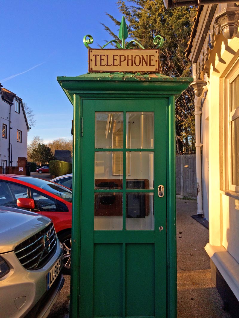
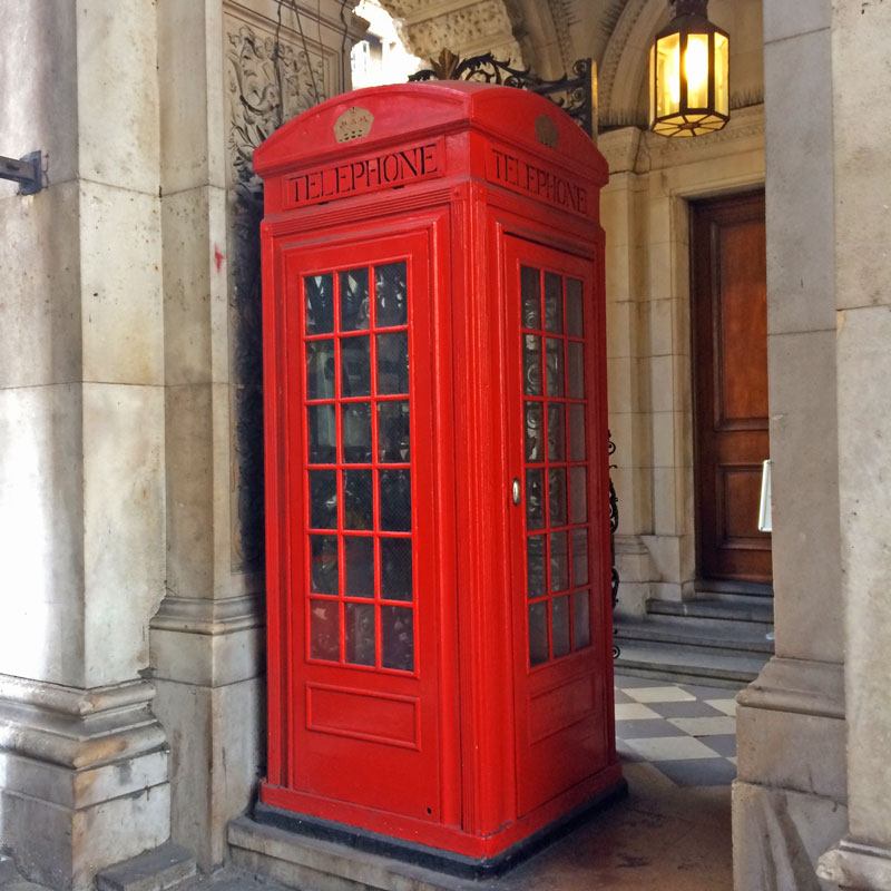
The iconic K2 model
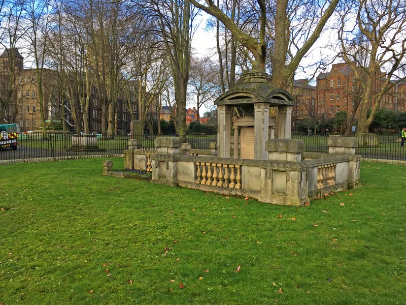
As usual, the English started to develop the phone box and organized a competition to design the kiosk, but none of the designs were creative enough. Therefore, a year later there was another competition and the kiosk had to be made of cast iron and the costs should not be more than 40 pounds according to the brief. Five models made of wood were judged behind the National Gallery and the K2, designed by the Giles Gilbert Scott was selected for the standard phone box. Scott was an architect who worked on famous buildings like the Battersea Power Station and the Waterloo bridge. No one would think that the distinctive shape of the iconic phone box was inspired by Sir John Soane’s mausoleum (neoclassicist architect who designed the building of the Bank of England). K2 phone boxes were painted red just like post boxes so that they are easily noticed and were used from 1926 onwards. Unfortunately, the production costs was 50 pounds per box, therefore further developments and adjustments were required.
The K3 model
The K3 model was a mix of it predecessors: it was made of concrete like the K1 but had the design of the K2. It was put in service in 1929 but was still too expensive. These models were painted cream.
The K4 model
The K4 was huge as the Post Office built a stamp vending machine and a post box into it so that it functions as an office. These were put into service in 1927 and its nickname was “red giant”.
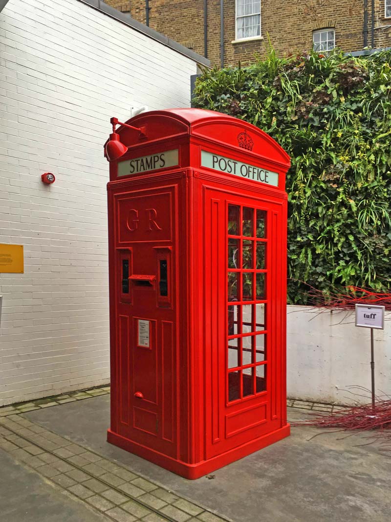
The K5 model
The K5 is a bit of a mystery and there are hardly any left. It was designed to be assembled and dismantled and used at exhibitions.
The most common K6 model
And then we got to the K6 model which is often called the jubilee box as it was designed for the jubilee of King George V. This type is to be found everywhere, mainly found in the UK and most probably this is the model you make a photo of (or a K2) 🙂 The K6 was designed by Scott as well, but was much smaller than the K2 and its costs were lower, too. This was the first kiosk that was spread across the country. The crown on the K6 was embossed and always painted red. If you find gold crown on a phone box it means it was refurbished. When Queen Elizabeth II was crowned, the Tudor crown was changed to St Edward’s crown on phone boxes.
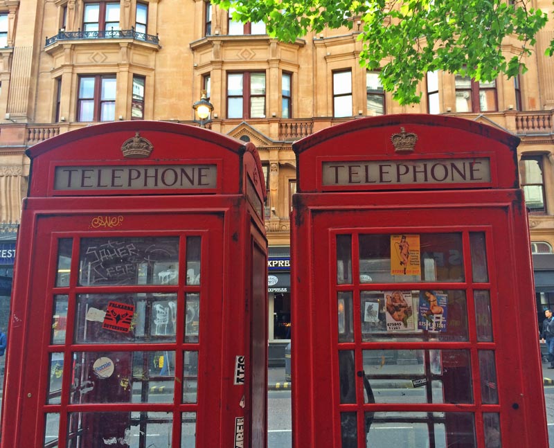
The colour
We could think that by this time the colour of the phone boxes were standard and obviously red, but there were some people who were not satisfied with the colour, finding it too jazzy. In 1946 the Council of Preservation for Rural England requested the Royal Fine Arts Commission to review the colour of the phone boxes. According to the commission, phone boxes in Areas of Natural Beauty (AONB) should be painted black, or grey, with red grids. The English did not put up with this decision and brought the case into the parliament. This time, 6 different coloured phone boxes were judged: red, light and dark Brunswick green, black, light and dark battleship grey. The grids on one side were painted red so that every variation could be considered. The decision did not change: the colour of the phone boxes remained red. Full stop. Why? No one knows. In my opinion the Post Office might have built a brand as the post boxes were too painted red and they were quite often put next to each other. Did they want a harmonized cityscape? Maybe and it would make sense.
And why are there some black phone boxes in Britain?
Because another service provider, the New World distinguish themselves with black painted K6 boxes from the red boxes of British Telecom. In these phone boxes you would find wifi, touchscreen information.
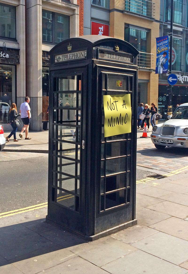
Other colours
Hull has always been a bit different with its cream coloured phone boxes. Because from 1911 onwards the Post Office provided telephone network all over in the country except in Hull and Portsmouth where it belonged to the local council. The one in Portsmouth joined the Post Office network, but the one in Hull remained under local direction. To distinguish their unique position they used the cream colour for phone boxes.
~
As I visit and observe the countryside, I realize how remote phone boxes are in villages: at the edge of the village, close to a trench where access is not easy, no streetlights available… Then I think to myself how a different situation we are in, in the world of mobile phones… Of course there are modern phone boxes after the K6 but that requires a new post…
FYI:
If you fancy buying an old phone box, it is available on internet for 900-1500 pounds.

Comments (0)